FENIX MARINE SERVICES
A new brand & streamlined experience for a major terminal at the Port of Los Angeles.
Project: Identity & Website
Role: Concept Development, UI Design
Firm: Jennergy, Inc.
Additional Credits: Junior Designers, Sean Sommerville & Felicity Brigham
Fenix Marine operates one of the largest container terminals at the Port of Los Angeles, near the deep-sea channel and the ship-turning basin. Before the terminal was known as Fenix Marine, it was known as Eagle Marine Service.
Assignment
Eagle Marine Services was acquired by new ownership, and the terminal name was changed, resulting in the need for a new visual identity, brand, and website.
Goals
• Create a new logo mark and visual identity
• Apply new identity to business cards and website
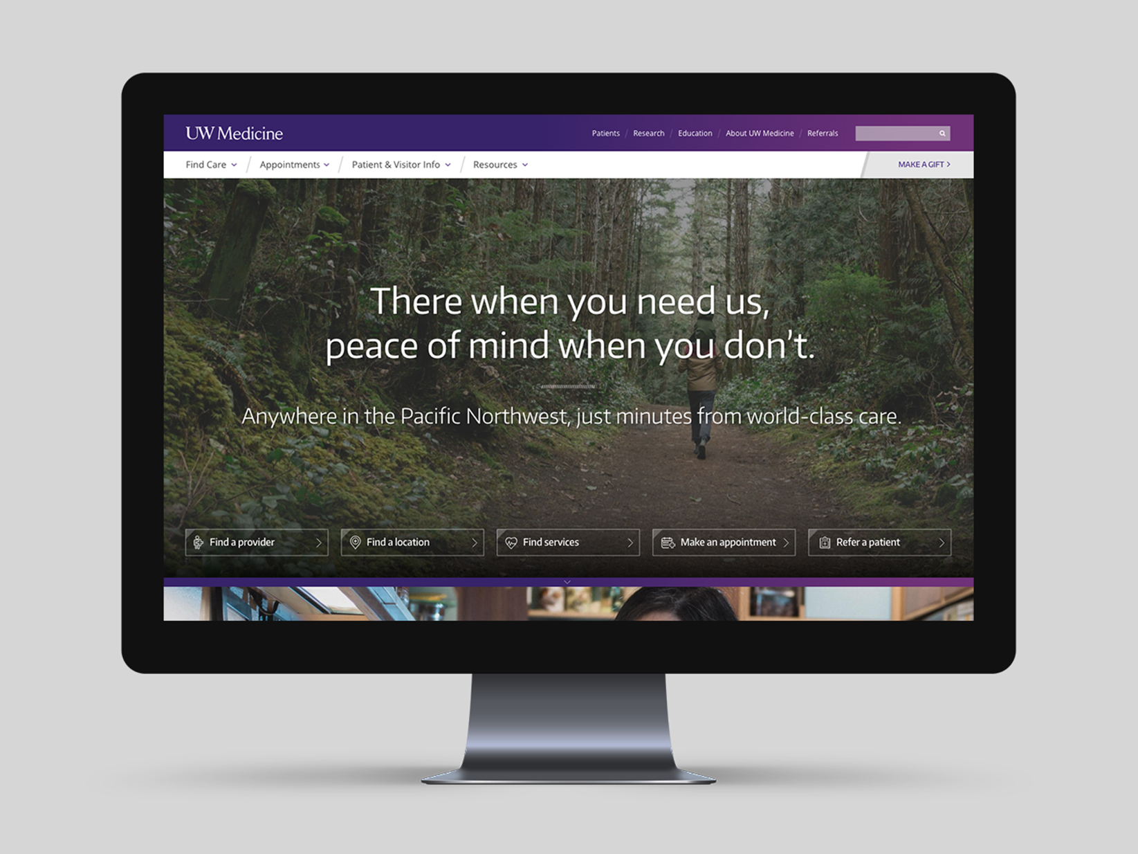
• Refresh existing website design, message, and architecture for a better user experience
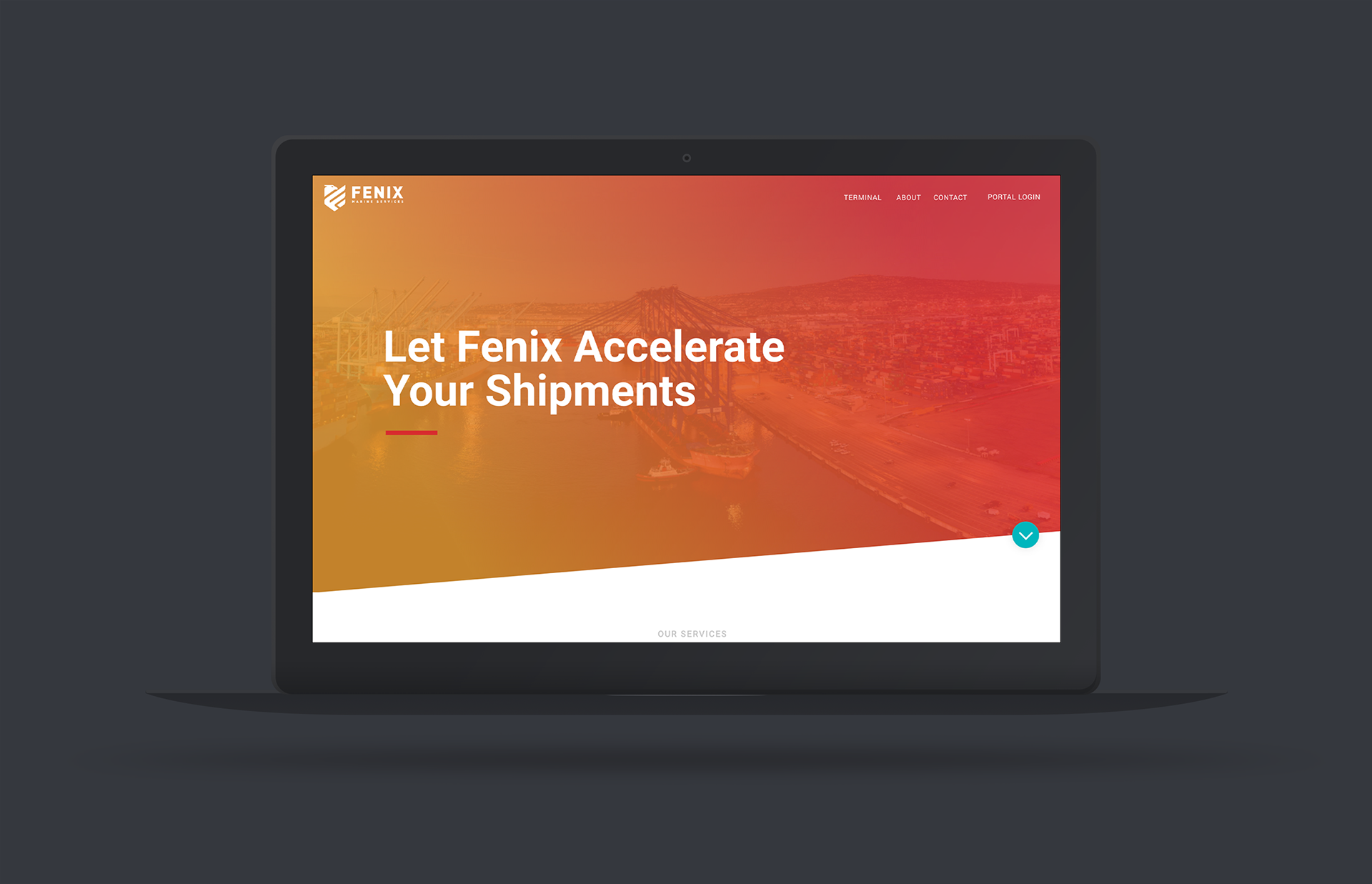
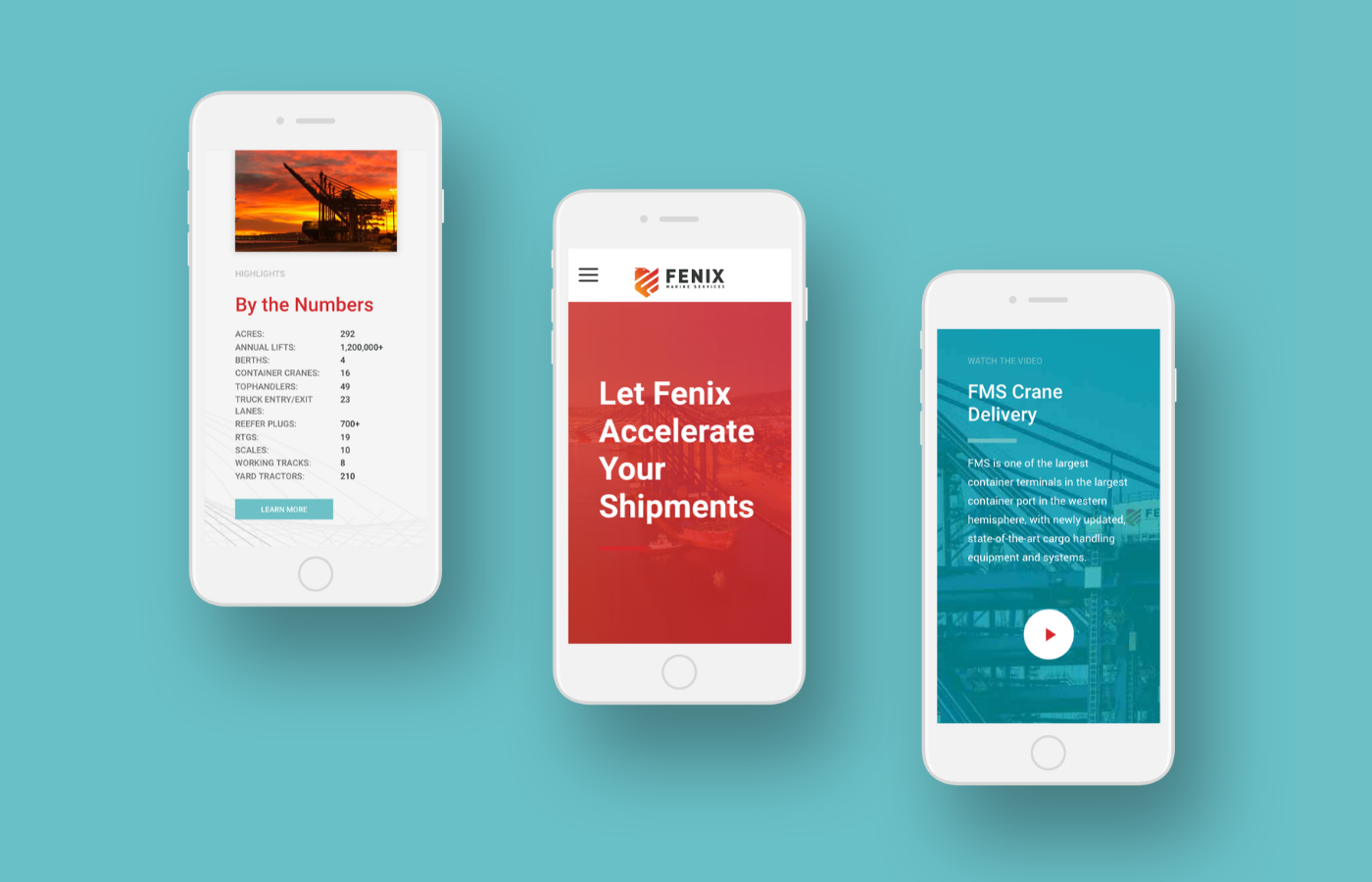
As project lead, I was tasked to take the project from concept to completion. I designed a new logo mark and prepared style tiles and mood boards for the creative director and client approvals. We worked with a copywriter/strategist to simplify the old website architecture and make it more user-friendly. Using Adobe XD, I designed the wireframes and hi-fi web comps and then worked with the junior designers to execute and deliver the site to the developers.
Outcome
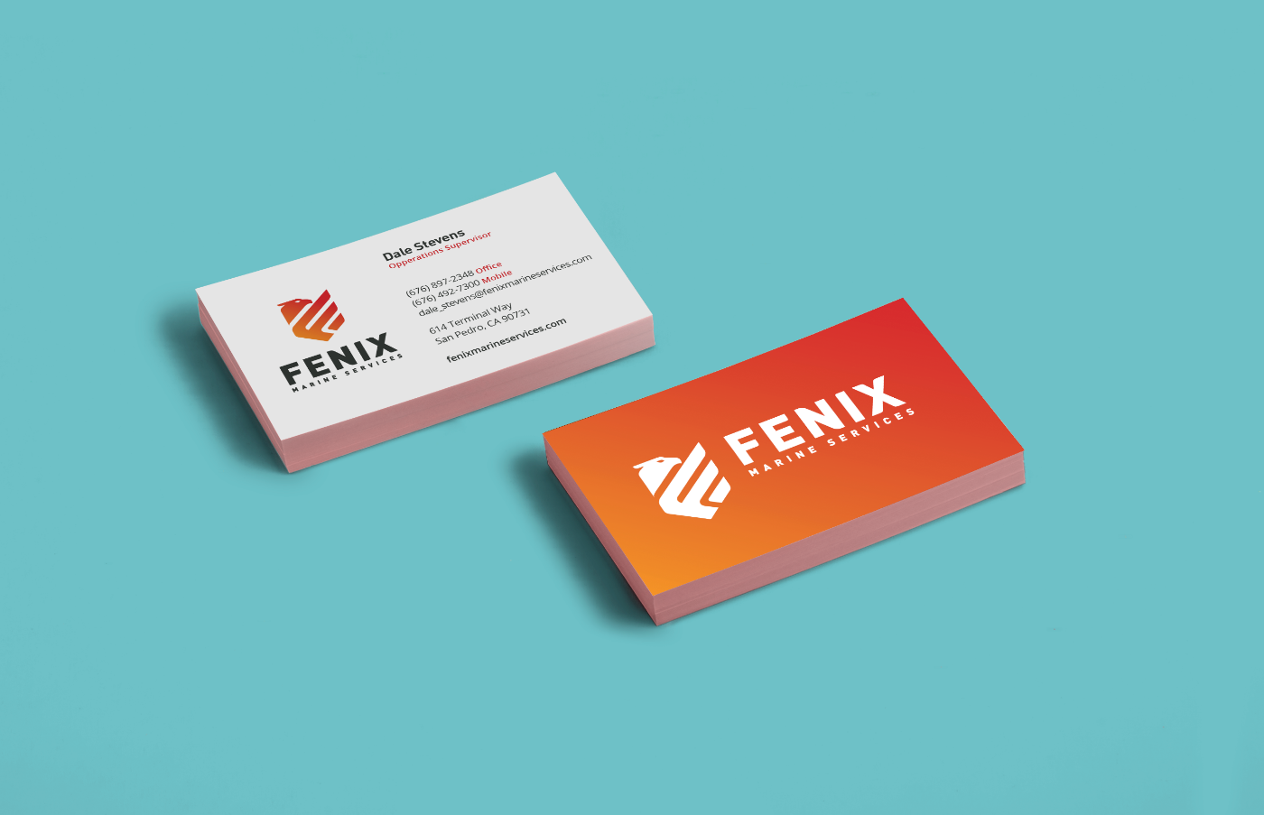
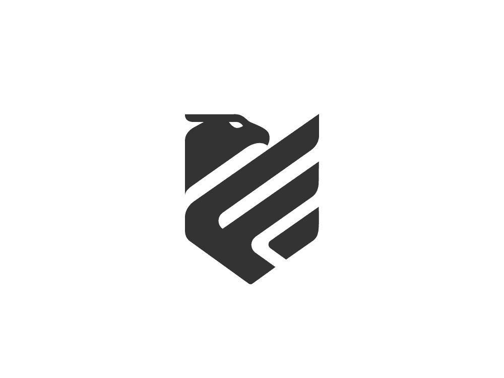
A logo mark symbolized Eagle Marine Services' re-emerging as Fenix Marine Services. I designed the logo to combine the phoenix bird, a shield representing security, and the letter "F" to create a simple, recognizable mark. In addition, the website was streamlined for a better user experience, allowing the most desired information to be found quickly. Overall, the rebrand was a success and continues to be applied to future materials.
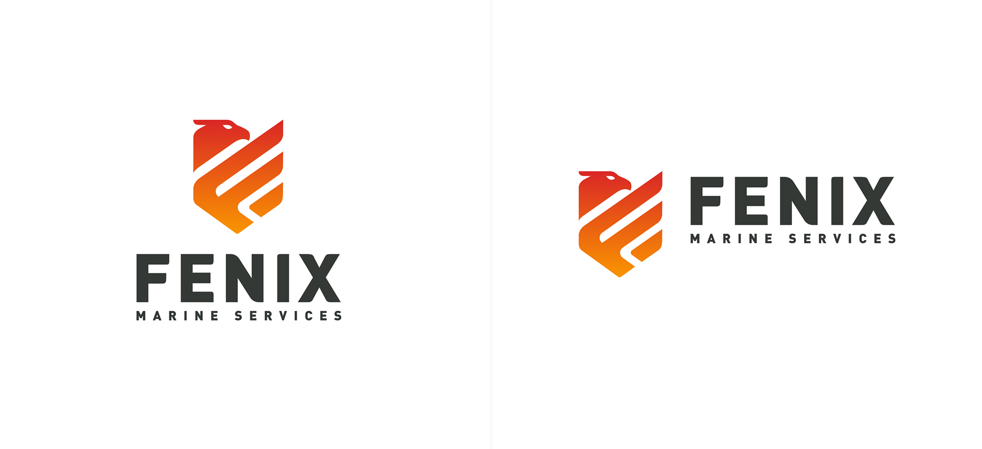
Bringing The Mark Together
The mark brings together the phoenix and letter "F" into a shield shape that represents the safety and security of working with Fenix Marine Services.

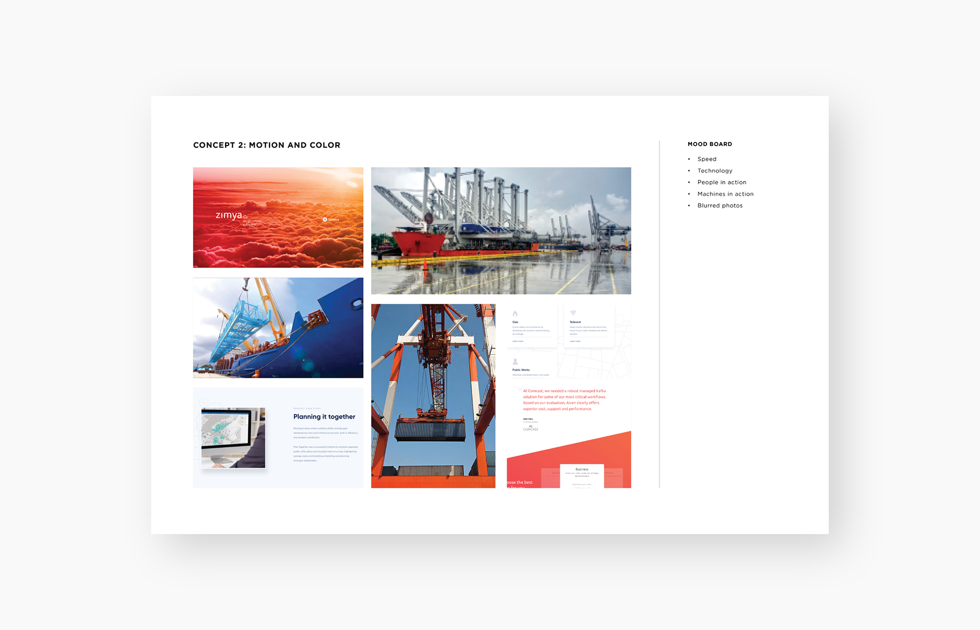
Setting The Visual Mood
As part of the process, mood boards were used to define the style and feel of the website and collateral.
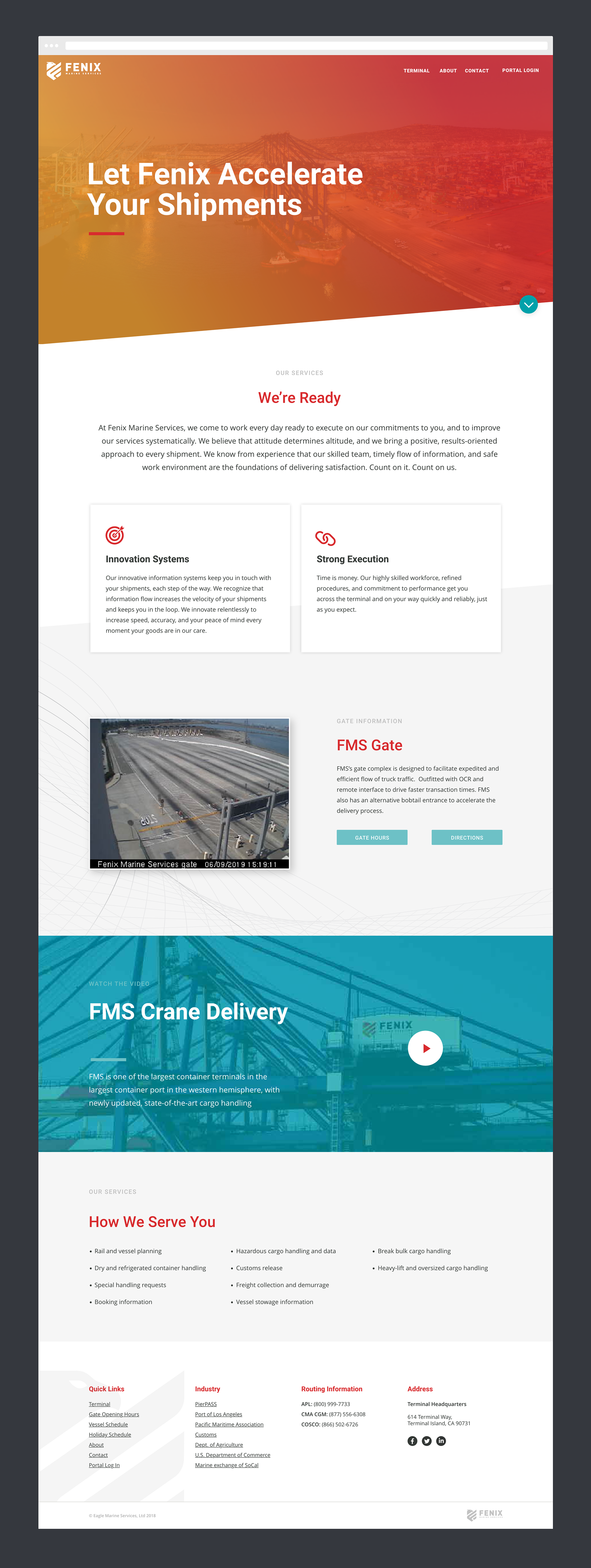
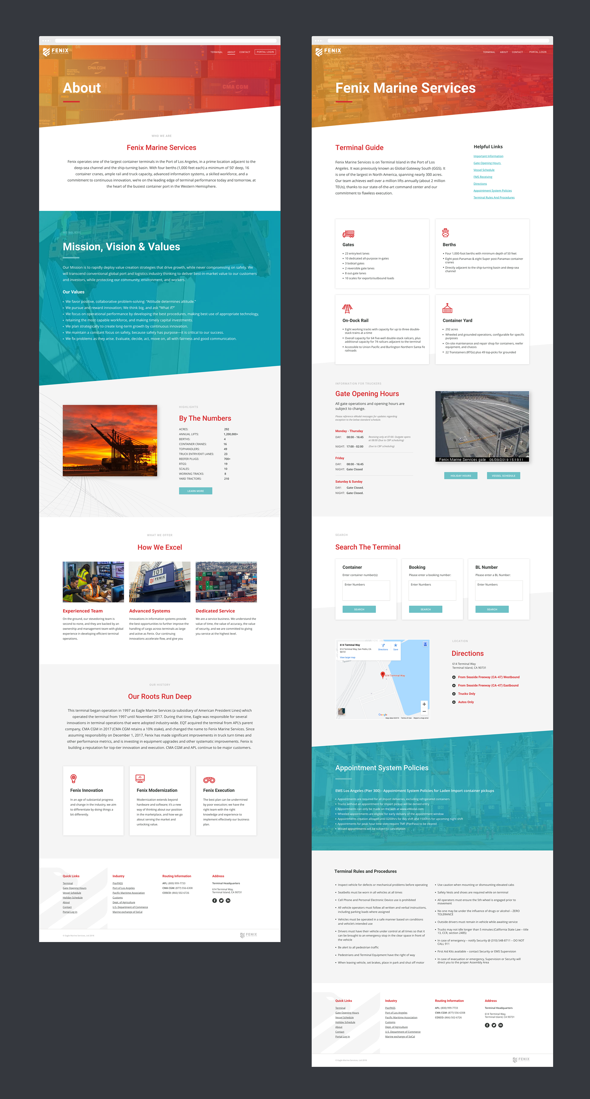
Responsive Focused
The primary use of the website was on mobile devices, this meant a good responsive design was important.
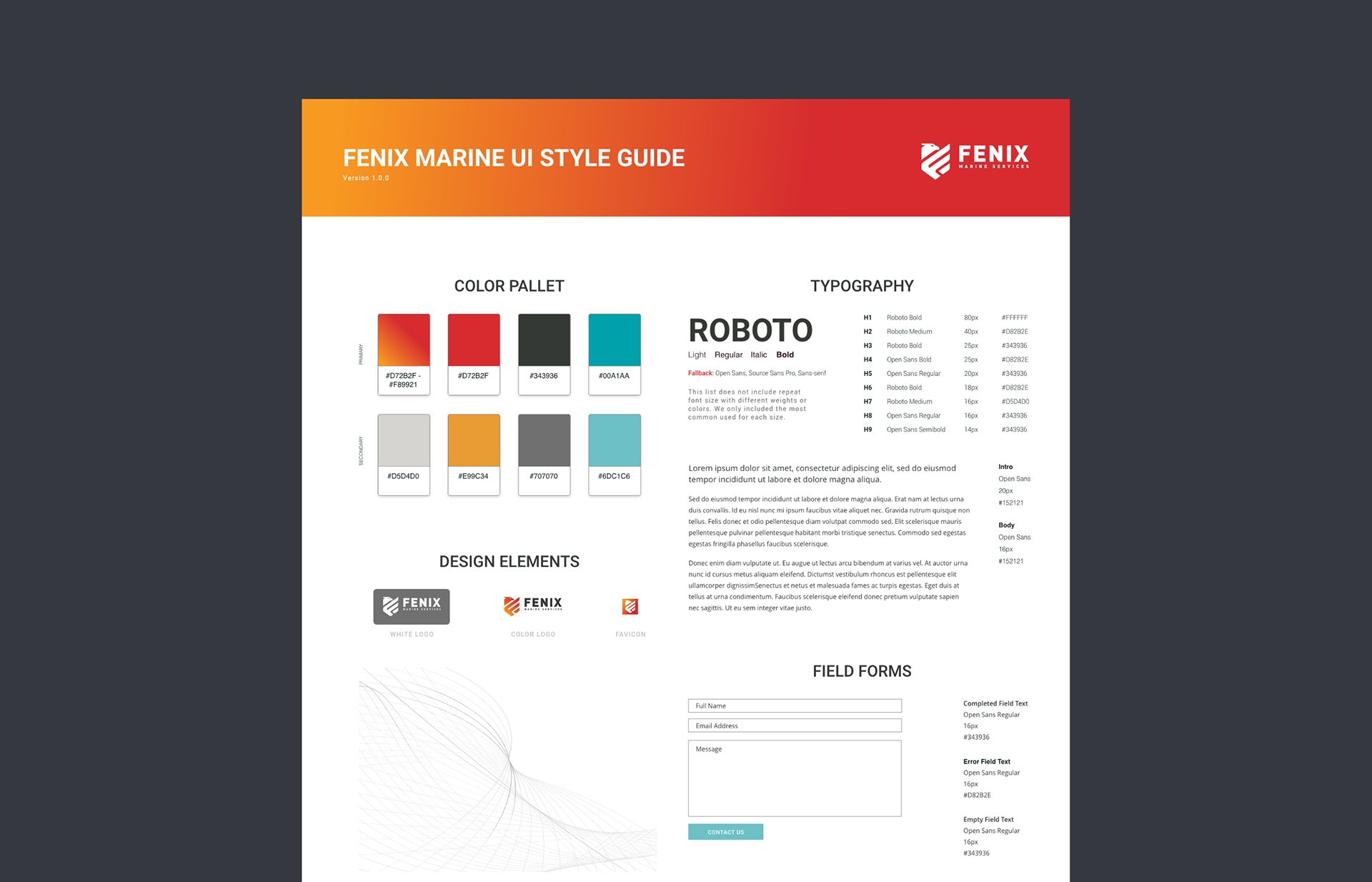
Creating Guidelines
A UI style guide and components were created to guide the website in development.
Collateral
As part of the rebranding process, new business cards were created to showcase the brand.